Showing posts with label Drawing;. Show all posts

Friday, May 21, 2010

Refilling the Well

Studio2010 My Studio (aka kitchen table)

Two weeks ago

Today, as I strive to write, I decided it is time to refill the well. I am making excuses as to why I shouldn’t have to write, or why I shouldn’t make art. When this starts happening, I find myself in need of a break. The break I need is to be silent and listen. Listen to my inner self. Find a way to refuel my inner artist.

There are many things that a person can do to refuel that inner artist. One thing that I like to do for refueling is go to an art museum. You have to go by yourself to be able to really listen to that inner voice. Don’t take the kids. Don’t take your best friend. Only take you. Don’t be afraid to go alone. Aloneness is what you need.

Refueling Stations -

  • Coffee shop
  • Library
  • Art museum
  • Park
  • Nature walk (nothing is more inspiring that pure nature)
  • Shopping
  • Restaurant for dessert (can you tell I’m hungry for sweets?)
  • Chapel

There are many, many more places to go. What is your favorite thing to do to refill the well?

Monday, May 17, 2010

Drawing Glossary – The Drawing Board

 Petunia Graphite

Petunia

2009 Copyright Valerie Jones


When I began drawing, people would use words that only the art world would recognize.  I had no clue as to what they meant.  Now that I know what they mean, I thought I’d share some terms that I frequently use when I teach.

I took these definitions from Betty Edward’s books Drawing on the Right Side of the Brain and Color.  A few also came from Lee Hammond’s book How to Draw Lifelike Portraits from Photographs

Cast Shadow:  The darkest dark, as close to black as possible. This is the shadow the object creates from being away from the light source.

Composition: The arrangement of shapes, spaces, lights, darks, and colors within the format of an artwork.

Contour Line:  In drawing, a line that represents the edge of a form or a group of forms.

Crosshatching:  A method of shading by using short parallel lines, often in superimposed sets of lines crossed at various angles to darken an area.

Edge:  In drawing, the place where two things meet (for example, where the sky meets the ground); the line of separation between two shapes or a space and a shape.

Foreshortening:  A way to portray forms on a two-dimensional surface so that they appear to project from or recede behind a flat surface; a means of creating the illusion of spatial depth in figures or forms.

Full Light:  This is where the light falls directly on the object. The paper will remain white.

Grid:  Evenly spaced lines, running horizontally and vertically at right angles, that divide a drawing or painting into small squares or rectangles.  Often used to enlarge a drawing or to aid in seeing spatial relationships.

Grisaille:  A method of painting that uses shades of gray in an underpainting to establish the value structure of a composition.

Halftone:  This is medium gray, the true color of the object. It is neither light nor dark so that is why it is called halftone.

Hue:  The name of a color.

Line:  A narrow mark that defines the edges of spaces and shapes in a composition.  Line can also be used for shading, as in crosshatching.

Negative Spaces:  In art, the shapes that surround the objects; sometimes considered background shapes.

Reflected Light:   This is the edge of the object, between the cast shadow and shadow edge. Reflected light is never white. It is closer to halftone in value. The value is between white and halftone.

Shadow Edge:  This is not the edge of the object. (The edge is the reflected light.) It is where the object is receding from the light, and is on the opposite side of the light source.

Sighting:  In drawing, measuring relative sizes by means of a constant measure (the pencil held at arm’s length is the most usual measuring device); determining relative points in a drawing – the location of one part relative to some other part.

Value:  The degree of lightness or darkness of a color.  White is the lightest, or highest, value; black is the darkest, or lowest, value.

Monday, May 10, 2010

The Drawing Board

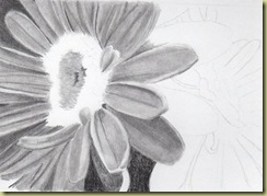
Gerber Daisies “Gerber Daisies”

Graphite on Smooth Vellum 4” x 6”

2010 Copyright Valerie Jones


“When the artist is alive in any person, whatever his kind of work may be, he becomes an inventive, searching, daring, self-expressive creature. He becomes interesting to other people. He disturbs, upsets, enlightens, and opens ways for a better understanding. Where those who are not artists are trying to close the book, he opens it and shows there are still more pages possible.” ~Robert Henri

Graphite Pencils is our topic of discussion today.  The Gerber Daisies picture was drawn using close to a full range of graphite pencils.

The “H” pencils are the harder pencils and create the lightest values.  I use these to redefine and smooth skin tone values.  In the daisy picture, I used these to create the mid-tone value of the flower petals.

Graphite H Range

 The “B” pencils are the softer pencils create the darker values. The “8B” pencil is almost as dark as charcoal which creates a nice black.  The “Ebony” pencil is close in range with a “6B” pencil.  It creates a rich dark that I use to create the darks in the pupil of an eye or shadows in the hair.


Graphite B Range

I use the medium graphite values to create a darker mid-tone.

Graphite Medium Range

Try these on your next drawing.  Is there a pencil that is your favorite?  My favorite is plane ol’ “B”.  It creates wonderful mid-tone values for me.  If you tend to be heavy handed, try “H” or “HB” for your mid-tones. 

Saturday, May 8, 2010

Art Associations – FANtastic Friday

BAA

A brag about my local art association. I am a member of the Bartlesville Art Association. Since becoming a member a five years ago, I have learned so much about art and the promotion of art. Not only that, these people get me! You know how sometimes your family just don’t understand why you do what you do? Well, these like-minded fellow artist do. Not only have I learned to get out of my shell and think outside of the box, I have made many lasting friendships as well. These artists are a wonderful source of inspiration.

The Bartlesville Art Association hosts many events that allow artists to showcase and sell their work. I have had the opportunity to sell work this way. It is a great way to meet collectors. So far this year, they have had a spring art show and several workshops. In June, they will be exhibiting artwork at the historic Dewey Hotel Museum from June 1-30. Also in June, they will participate in the OK Mozart Festival from June 11-19. This event allows association members to showcase their work. People from all over the nation participate in music festival. In July, they will exhibit artwork at one of the local retirement homes, Green Country Village. The first weekend in November, they will be hosting their Fall Fling. Holiday shoppers enjoy this opportunity to purchase unique gifts for Christmas.

They have monthly meetings. Members and non-members are invited to their monthly meetings that provide people with information and/or demonstrations from artists. These meetings are well-attended and very inspiring.

They host workshops. In August, I will be teaching a 2-day workshop on how to make Christmas Cards. In October, Todd Williams will be giving a workshop on “7 Keys to Unlocking a Great Painting”.

If you are from the Bartlesville area, please contact me for membership information about the Bartlesville Art Association at valmj2u@yahoo.com.

Your local area doesn’t have an art association or group? Try looking online. Wetcanvas.com is a wonderful online resource for artists of all types. Scribbletalk.com is another great resource for artists who enjoy working with colored pencil and graphite. There are others out there. Is there an online group that you are a member of that I don’t have listed? I’d love to hear about it so I can become a fan too.

I just finished an online class about blogging. This class was hosted by Alyson Stanfiield from Art Biz Coach and Cynthia Morris from Original Impulse. I received wonderful advice from these two ladies plus met a wonderful group of bloggers. These people will be my source of blogging inspiration for many months to come.

Become part of a group. Don't just stay in the studio. Get out and mingle. Be inspired. It will help sell the work you create while in the studio.

Monday, May 3, 2010

The Drawing Board

Macy Crop

“Macy’s Joy”

Graphite on Strathmore 500 Series Plate

10” x 8”

Copyright 2010 Valerie Jones


Welcome to The Drawing Board where we discuss everything that pertains to drawing. 

Today, we are going to talk about paper.  Your drawing surface is just as important as the subject you are drawing.

I always have my graphite students draw on Strathmore 300 Series Bristol Smooth paper.  This allows a smooth texture to be created for the drawing.  This is a student grade paper, so it isn’t the best quality paper out on the market.

When I do a drawing for commission, I put it on Strathmore 500 Series Bristol Board Plate 4-ply.  It lets you create the smoothest texture, plus gives you breathing room for erasing mistakes and re-applying graphite without smudging.  The 300 Series will sometimes create smudges or darker areas around what has been erased. 

I encourage you to try different papers.  Sometimes your subject will need to have texture and some drawing papers have enough tooth to allow wonderful textures to be created.

If you have a favorite paper you use for drawing, I would love to hear what it is and how it works for you. I enjoy experimenting with different papers!

Thursday, January 7, 2010

January 2010 Art Exhibit

Valerie Jones

Art exhibit

Fine Art Portraits and Still Life Drawings in

Graphite and Colored Pencil

The Intermission Email

Bartlesville Examiner Enterprise

4125 SE Nowata Road

Bartlesville, Oklahoma


January 7-28, 2010

Monday – Friday

10:00am – 5:00pm

Thursday, December 31, 2009

Art Review 2009

img234 small

Commissioned Piece

Copyright 2009 Valerie Jones


I am not one to make yearly goals because they very rarely are achieved.   “Live by God and He’ll do the planning for you”…that’s my motto.  I did make a list of goals for 2009 and I only accomplished one of them.  I decided to make a list of accomplishments for 2009 and share them with you.

2009 Accomplishments

January – Held an exhibit for my students; took a quilting class

February – Completed “Colors of Fall” colored pencil painting

March – Sewed aprons; Opened Etsy shop; completed “Wedding Day 1920” colored pencil painting

April – Bartlesville Art Association Spring Show – sold “Colored of Fall” painting; completed “Homecoming” colored pencil painting

May – Verdigris Valley Exhibit; Completed “Intermission” colored pencil painting

June – Sold artwork in the OKMozart shop; taught grisaille/colored pencil class

July – Vacation; completed graphite “Gerber Daisy” drawing

August – Taught colored pencil workshop – textures and metals; taught ellipse class; began teaching at Washington County Elder Care

September Began teaching cat portrait class

October – Taught colored pencil workshop – textures and metals; prepared for the Bartlesville Art Association Fall Fling

November – Completed graphite commission

December – Completed colored pencil commission

January – December - Created a correspondence drawing course – Had 2 students take the course throughout the year.

January – May – Taught a colored pencil step-by-step portrait class

April – May – Taught a beginning drawing class at Hobby Lobby

August – December – Taught a colored pencil cat portrait class

Completed 10 paintings/drawings in 2009  (This is less than 2008’s number of 13 paintings/drawings)

2010 is looking to be another successful year.  I have two exhibits coming up in January and February.  I am in the process of creating a website.  I hope to attend a workshop in June.  I have a workshop to teach in August.  I’m sure God has other things planned for me this coming year also!

Happy 2010!!

Tuesday, November 17, 2009

How Do You Spend Your Time?

185small

Copyright 2009 Valerie Jones

I took this picture the other day of a tree at work.  It was a picture perfect day outside and the reds just shone on this tree.

My question to you today is - “How do you spend your time during the day?”  Are you doing things you want to do, (art for example) or are you spending more time with things  you feel you should do? 

I made a list of 5 things I spend my time doing during the day and as it turns out, they are all things I have to do, work, cook, clean, raise children, and I forgot the other one!  There is no time for creativity.  Oh, I remember the 5th one now.  It is watching television in the evenings.  Watching television isn’t something I have to do.  It’s what I do to wind down after a hurried and flurried day of constant activity.  I usually draw while watching TV, so it’s not a total loss of time.

I’d like to hear if you spend your day in a creative way…

Friday, November 13, 2009

Commission Finished

Roses

Graphite on Strathmore Series 500 Bristol Plate

Copyright Valerie Jones

Word of caution – Don’t finish a piece of artwork late at night…it leads to sleep apnea.  That’s what happened to me anyway.  I finished this commissioned piece last night around bedtime.  Well, I had to stay up awhile to wind down!   I’m still only showing a partial of the drawing because it is a gift.  I might show the whole thing in January.  You all will have to remind me.

I really enjoyed working on the Strathmore 500 Bristol Plate drawing paper.  I was able to achieve a realistic texture for the skin.  It also let me erase and re-apply without any differences in the texture of the paper.  The Strathmore Series 300 Bristol Smooth won’t allow much erasing before it messes up the tooth of the paper.  It’s more student grade, so that’s to be expected, I guess.  Also, the Series 500 Bristol Plate is 4-ply.  I like to work with thicker papers because they are easier to control.

I didn’t realize how much of myself was put into this drawing.  After I was done, tons of tasks came to mind that I’d shoved to the back burner.  So, today was a busy, busy day.  I got a lot accomplished, which I am thankful for.

Have a beautiful day!!

Friday, October 30, 2009

Cat Portrait Complete

Shorty Complete Small

“Shorty”

Colored Pencil on Stonehenge Paper 8” x 10”

Copyright Valerie Jones

I am finishing up a class on pet portraits.  We drew “Shorty” over a period of 9 weekly classes.   Some students are still working on her but most of them have finished.  She was fun to paint.  This is our family pet, but I based the lessons from Anne deMille Flood's Realistic Pet Portrait book.   One of my students brought some white India ink to class and we used it for the whiskers.  We had impressed the whiskers first using a stylus.  Then, as a finishing touch, we added the ink.  It was an awesome tool to use.  It works better than a white colored pencil and isn’t as thick as acrylic paint.

Thursday, October 29, 2009

Work in Progress #2

img213

Work in Progress – Graphite on Strathmore 500 Bristol

Copyright Valerie Jones

I have been steadily working on this piece.  I usually spend at least one hour of an evening.  Last night was not a good evening to draw.  I was exhausted from working at my day job, working on this drawing, and getting ready for an art sale with my local art association.  I’m in charge of getting the art sale together for the art association’s members this year.  Thankfully, the dear lady who worked with it last year has been a huge help.  I’m still tired this evening, so I’m not sure if any good drawing skills will abound tonight.

Happy drawing!

Tuesday, September 8, 2009

Cat Portrait

I am currently teaching my students how to draw a cat.   I have detailed instructions on how they need to layer each color, how sharp their pencil needs to be, and how light or heavy of a pressure they need to use with their pencil.  I also have work-in-progress pictures of each step for their reference as they go along.

Here is an example of a step.

Step 17 - Demo 11 – Color: Henna - Point: Very Sharp – Pressure: Medium

Apply Henna to the darkest areas of the ears, pressing harder in places to give shape to the ear.

Here is one of the work-in-progress pictures.

Demo 11 I am toying with the idea of possibly making project kits for you to purchase and try for yourself.  Let me know if this is something you’d like to see from me.

I had the best thing happen to me today while teaching at my new job.  One of the participants must of had a great art day because when we were finished, she gave me the biggest hug.  Don’t you just love it?

Saturday, August 15, 2009

Work In Progress – Graphite Gerber Daisy #2

WIP 081409

Copyright  Valerie Jones / Graphite – Carbon  Drawing 

Things took on a new chapter in my life this week.  I started a new job working at a daycare facility for the elderly.  My job duties are that of an art coordinator.  The first few days were extremely overwhelming as I try to figure out everything that is required of me and what is needed by the people that participate in this wonderful program.  I’m excited about all the new things I get to learn about Alzheimer’s and the effects of aging.  There are great things that these people can achieve through our world of art.  I don’t know yet if I will be posting my experiences here or not.

Anyway, above is my latest attempt at relaxation.  I have another work in progress that is colored pencil.  I haven’t worked on it much lately.  Time is precious these days.  The kiddos started school this week, so routines are starting to fall into place.  Maybe in a few weeks, things will settle down some.

Wednesday, July 29, 2009

Gerber Daisy

DaisyBackSmall

Graphite Drawing

Copyright 2009 Valerie Jones

Here’s my latest attempt at drawing.  I didn’t keep close track of the hours it took to create.  I’m estimating 5 hours of drawing pleasure.  This was done using graphite pencils and willow charcoal.  I had never used willow charcoal before.  I am pleased with the smooth, rich darks it creates.  Don’t use it until you are done with your drawing though.  It tends to easily smear.

Happy drawing!

Thursday, July 16, 2009

Criticism

My lack of posts lately have been from exhaustion and vacation.  I’m sorry I haven’t been here for you.   I took some great photos while in New Mexico.  If you haven’t been to Santa Fe, Albuquerque, or Madrid, New Mexico you must go sometime in your lifetime.  Many, many art galleries to be seen plus a lot of local culture.

325a

Copyright 2009 – Valerie Jones

My topic today is criticism.  How do you handle those times when people seem a little cruel and misunderstanding about your art?  Does the child within you step out to lick the wounds?  I read an article today from Body + Soul magazine, the May 2009 issue.  It states when someone lashes out at you in criticism, their inner child is speaking to you.  What insecurities could this person have that we don’t see?  When you realize this,  it is easier for your inner child to respond to the criticism.  Take a lesson from the criticism instead of burying it deep within you in anger.  Although we’d like,  we aren’t going to be approved by everyone in this world.  So, take a deep breath, exhale, and move forward in positive action towards the criticism.

Tuesday, June 23, 2009

Petunia Mystery Solved

Petunia Grisaille2

Petunia – Grisaille

Copyright Valerie Jones

The petunia was done with the grisaille technique of layering grays (in this case, graphite) with colored pencil. The grays being laid down first allows the shadows to be in place, thus a lesser need for more layers of color in the shadow areas. I think this took me around 5 hours to complete. I didn’t keep track of my time very well. It is done on a 4”x6” piece of smooth bristol paper.

  • Merriam-Webster’s definition of grisaille -

grisaille

Main Entry: gri·saille

Pronunciation: \gri-ˈzī, -ˈzāl\

Function:noun

Etymology: French, from gris gray, from Middle French

Date: 1848

: decoration in tones of a single color and especially gray designed to produce a three-dimensional effect

Tuesday, May 26, 2009

Lips in Colored Pencil

I thought I would share with you some of the lessons I teach to my students.  Last week in class, we drew lips in colored pencil.

Lips Color Reference Photo

First, we used light washes for the skin tones around the lips.  The skin tones were created using the following Prismacolor colored pencils.

Cream, Light Peach, Jasmine, Pink Rose, Yellow Ochre, Beige, Peach, Peach, Blush Pink, Rosy Beige, Goldenrod, Blush Pink (again), Clay Rose.

In the darker areas of the face we used, Pink, Burnt Ochre, Mineral Orange.

We burnished the whole face with Light Peach.  After burnishing, we added a light layer of Greyed Lavender and blended with the Colorless Blender.

Lips for Color

For the lips, we left the highlight area the white of the paper.  We then applied a light wash of Peach, Blush Pink, and Pink.  To the line where the lips meet, we added Dark Brown, Henna, Terra Cotta and Tuscan Red.  We also added Henna to the shadow parts of the lip. 

One thing to remember about lips, the upper lip curves in and the bottom lip curves out.  The upper lip is always darker than the bottom lip because it curves in and doesn’t receive the light.  The bottom part of the bottom lip is darker because it is curving down toward the face.

Lips in Color

Print these off and try them for yourself!

Friday, May 1, 2009

Work in Progress
Prismacolor Colored Pencil on Stonehenge paper
14" x 11"
Copyright - Valerie Jones


As I mentioned in a previous post , several of my friends have new websites and blogs.

Belinda Lindhardt is an Australian artist, graphic designer and illustrator. She has some beautiful artwork on her webpage. Most of her work is for sale. Be sure to check it out. If you need some help with design, I'm sure she'd be happy to assist you!

Sunday, April 19, 2009

Sneak Peak


Here's a sneak peak of my current colored pencil work in progress..............

Saturday, April 11, 2009

Finished or Not?


I was on a roll last night...drawing the night away. I stopped without putting a background in. I worked on this today and put the background in. I don't like how it turned out. I should have made the background all one color or left it white. It looks like my son is floating in the air or his head is growing of grass.


This piece is titled "Homecoming". Our children are adopted and I chose this format because they came home to us partially grown. Thus, the half-face portraits.

I'll sit on this one awhile before I call it finished. I've already sprayed workable fixative on it, so it's not going to be much fun to change.

I hope you all have a blessed Easter!